
Problem
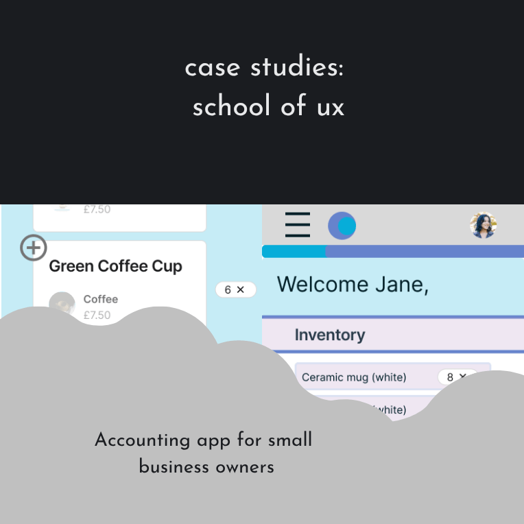
Small business owners selling online often rely on multiple tools to manage inventory, invoices, and finances. These tools are frequently complex, time-consuming, and not designed for users managing both physical and digital products.
They needed a simple way to track inventory, send invoices and understand profit, loss and tax implications.
User Survey & Personas
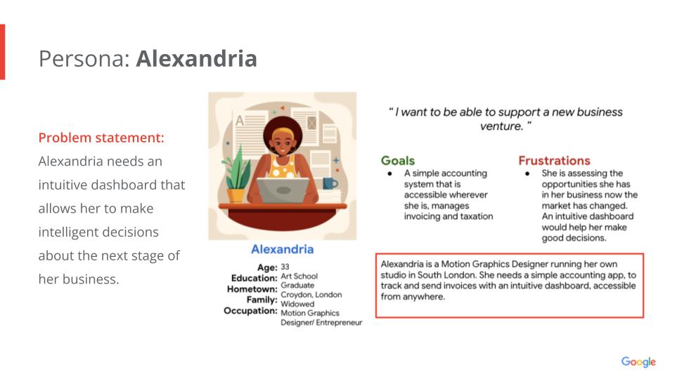
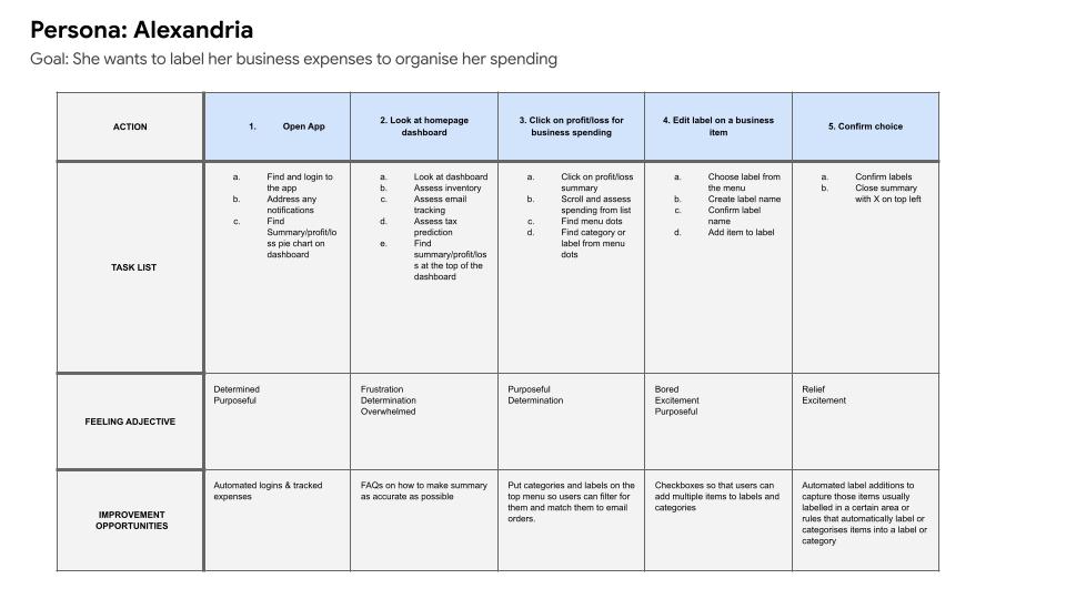
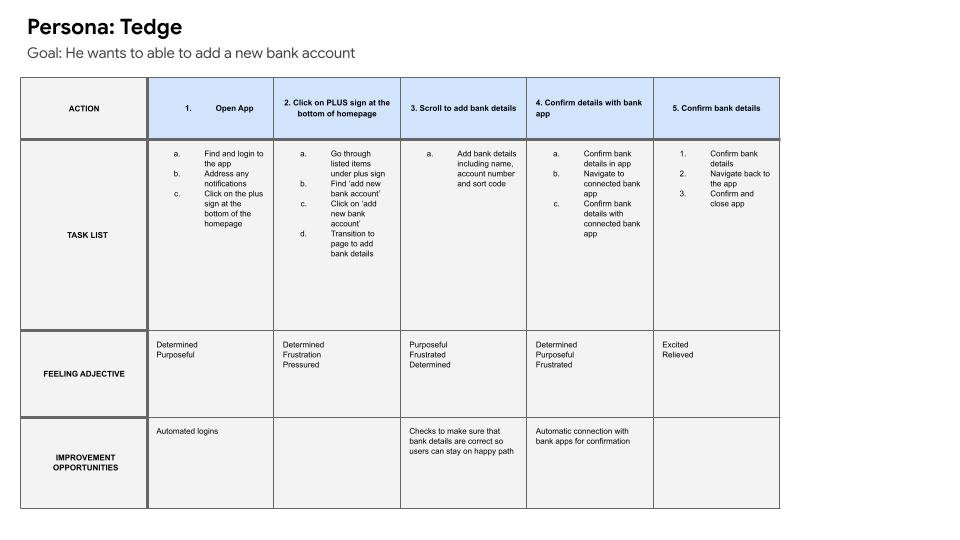
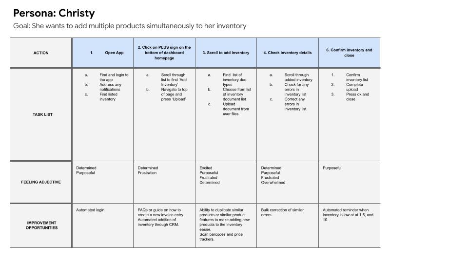
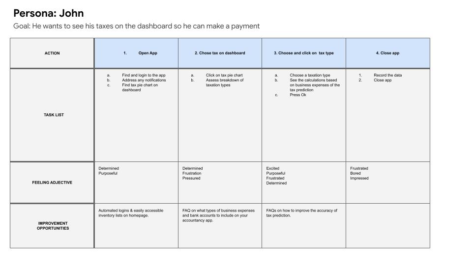
I conducted a survey to identify potential users and their pain points. From this research, I created four additional personas—Tedge, Alexandria, John, and Christy—to validate needs across different business types and experience levels.
User personas
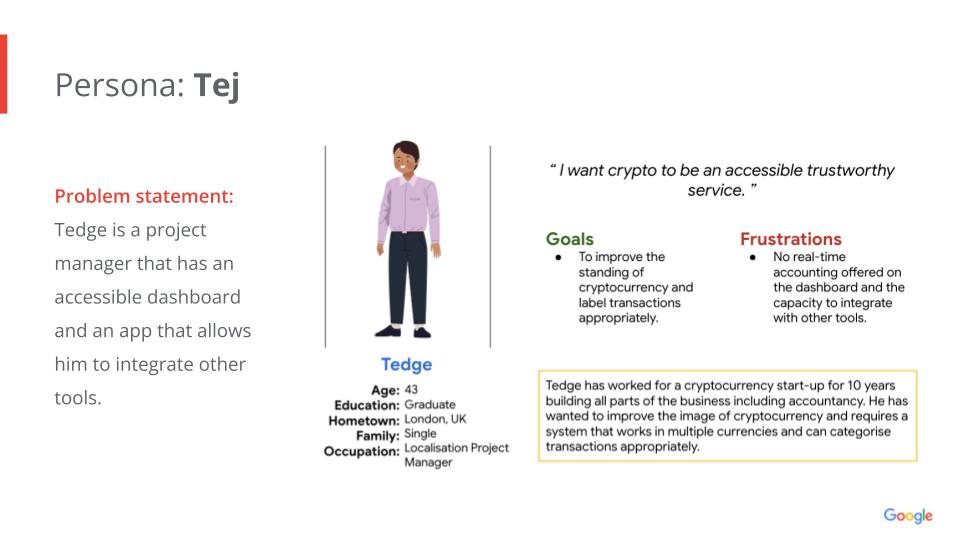
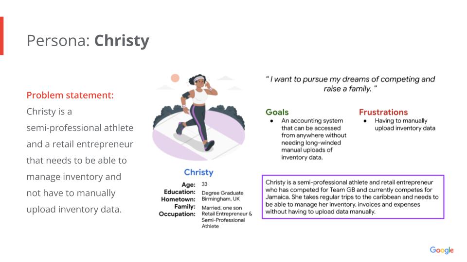
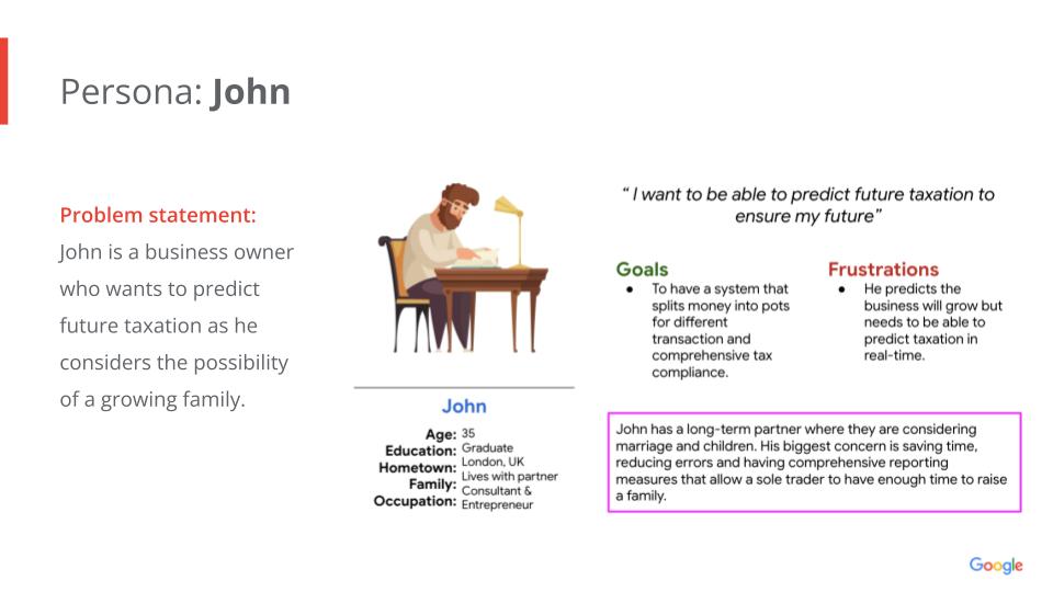
- Users wanted clear, accessible dashboards for forecasting
- Inventory management is needed to support both physical and digital items
- Tax visibility was important, but only at a high level, e.g. tax contributions and profit level
- Overly complex tools created friction and reduced adoption, e.g. having to add APIs for multiple services
User journey mapping
The approach: Ideation

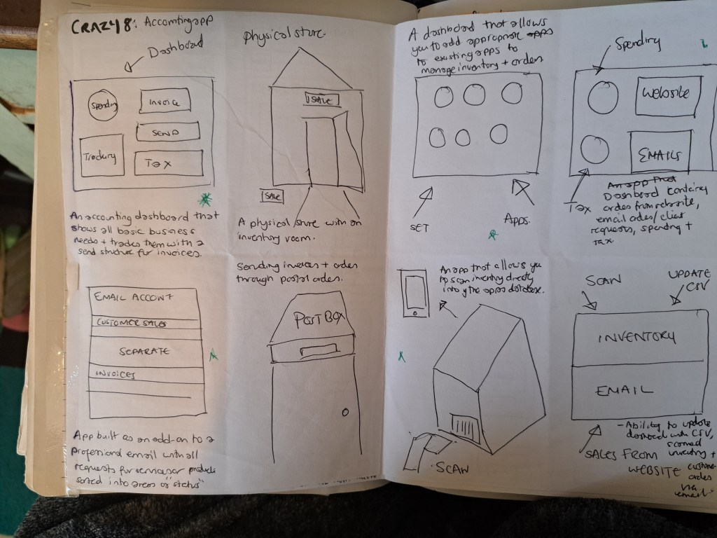
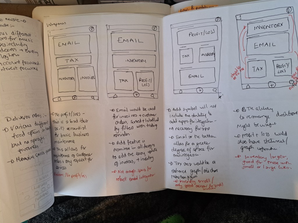
I completed a Crazy 8s exercise to explore solutions rapidly. Initial concepts included:
- An accounting-focused dashboard
- A digital postbox for invoices
- Physical store inventory tracking
- Email-based order ingestion
The point of this exercise was to explore as many options as possible. From the conventional to the unconventional.
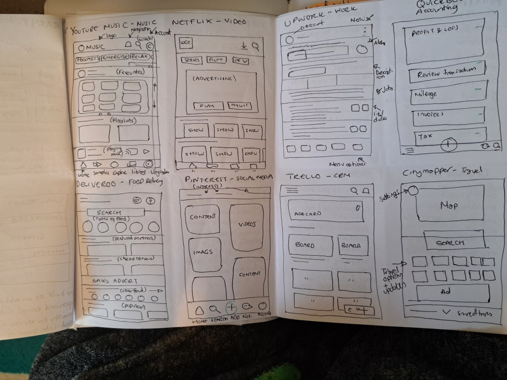
To help with understanding the structure of apps and how I use them, I put together 8 of my most commonly used apps. These included YouTube Music, Netflix, Upwork and QuickBooks.
I examined how they organised content, what types of methods they use to encourage engagement and how they lay out content cards.
Competitive Analysis
I analysed QuickBooks, FreshBooks, Xero, and Zoho Management, evaluating them against persona needs.
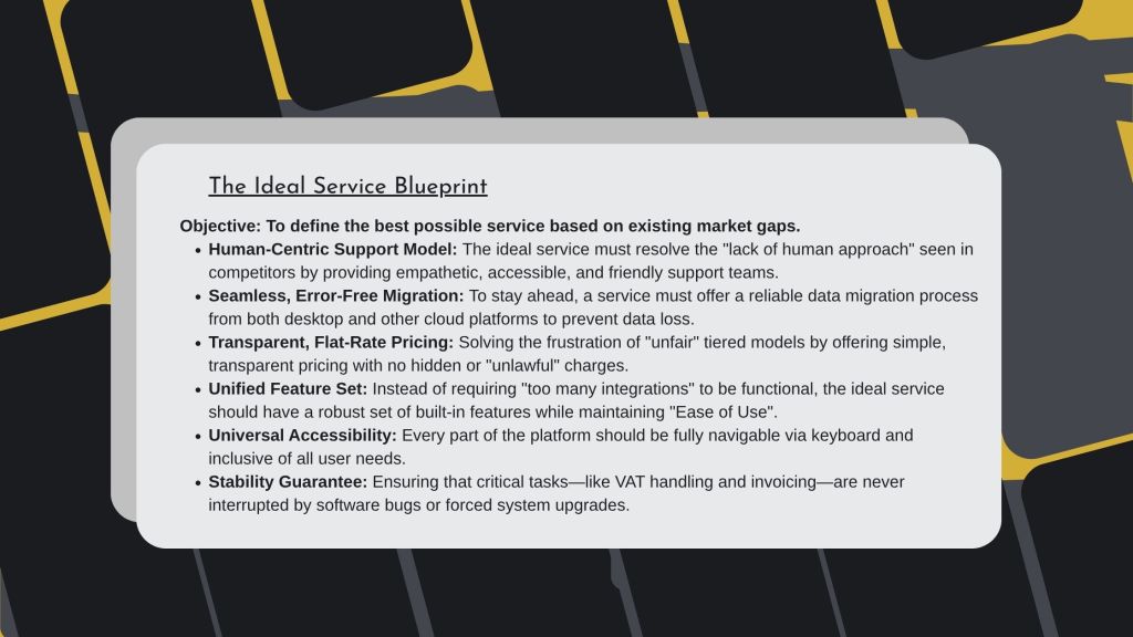
To ground ideas in real-world patterns, I reviewed existing solutions such as QuickBooks, Trello, Upwork, and Zoho. I determined that email and freelance platform integrations were unnecessary, as financial data could already be captured through bank transactions.
- Zoho offered the most features, but suffered from usability issues due to complexity
- QuickBooks provided a clearer, more familiar experience
Prototype
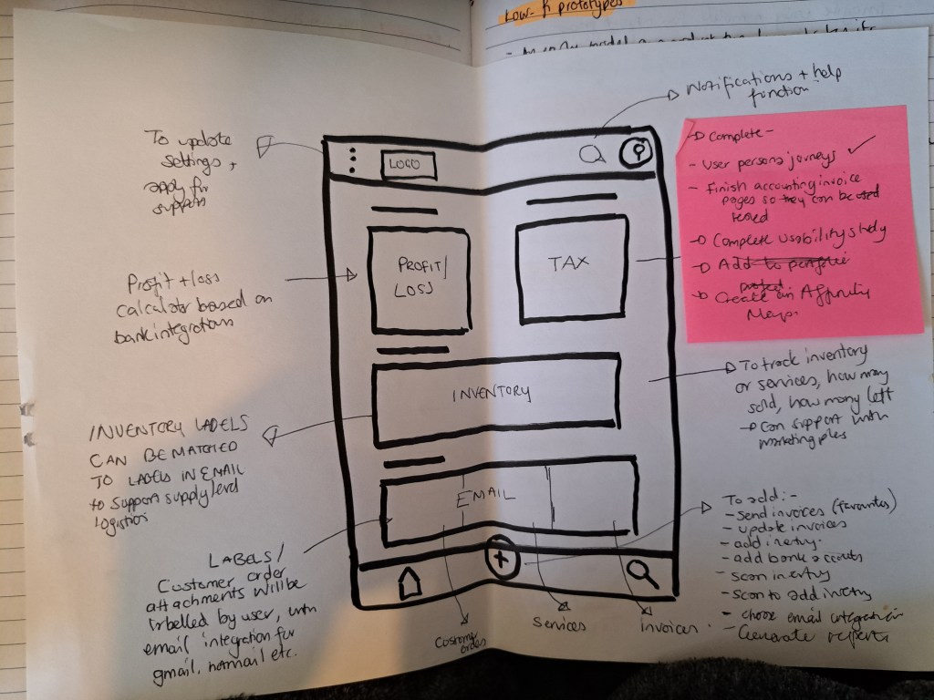
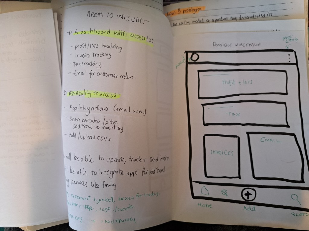
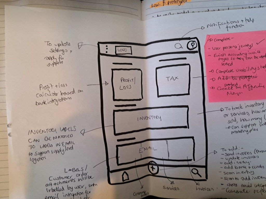
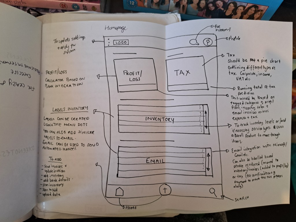
The final prototype featured a centralised dashboard with:
- Profit and loss tracking
- Invoice status tracking
- Tax summaries
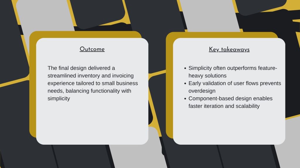
The experience supported both physical and digital inventory in a single workflow, improving accessibility and efficiency for small business owners.
Design decision:
I chose to design a pared-down, QuickBooks-inspired experience, prioritising clarity, ease of use, and reduced cognitive load.
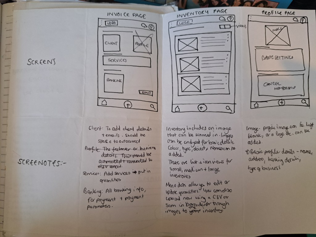
I created paper sketches, low- and high-fidelity wireframes, and iterated based on user priorities.
An early concept included email integration for invoices, but usability testing showed this added unnecessary complexity. Since invoices were generated within the app, tracking and returns could be handled internally
Key User Flows
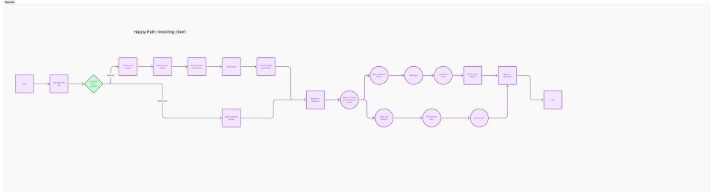
- Add new inventory
- Create invoices
- Update inventory
- Design iterations led to:
- Camera functionality for photographing physical stock
- Image uploads for inventory items
- CSV uploads for bulk inventory management
- Clear summaries for profit, loss, and tax tracking
Testing

Initially, I designed separate user journeys that were later combined into one. This resulted in:
Over 30 unnecessary screens
A user flow that was difficult for users to complete
After feedback:
Reduced the experience to essential screens
Added five meaningful interactions to create a usable prototype
Built reusable components to improve consistency and iteration speed
[Figma/Quickplayer]
 MtGoPortfolio