
Role: UX Designer
Project Type: Portfolio Project (School of UX)
Platform: Mobile App
Industry: Retail / Grocery
Tools: Figma, Canva and ChatGPT
Project Overview
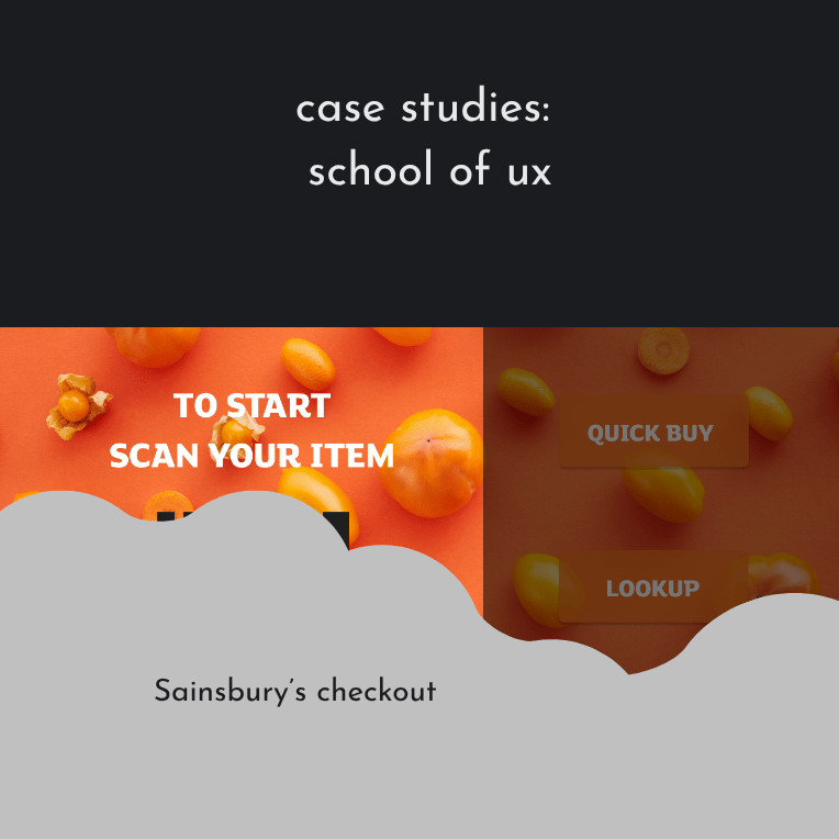
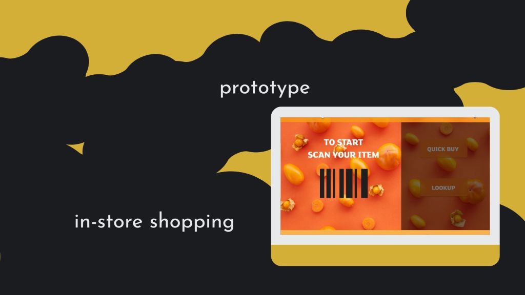
This project explored how Sainsbury’s could reduce checkout time in response to the removal of weighing scales at checkout. The focus was on designing a faster, more intuitive scanning and purchase flow, particularly for customers buying loose fruits and vegetables.

Business Problem
Sainsbury’s planned to remove weighing scales from checkout areas, creating friction for customers purchasing loose produce.
The business needed to:
Preserve brand loyalty during a high-friction moment in the journey
Decrease time spent at checkout
Maintain a smooth experience for loose fruits and vegetables
Reduce customer frustration caused by slower scanning or manual lookup
Goal
Design a mobile app experience that:
Goal
Design a mobile app experience that:
- Speeds up checkout
- Minimises cognitive load during scanning
- Provides clear shortcuts for common purchases
- Encourages continued use of Nectar rewards
Quick Buy Feature
To reduce decision time at checkout, I introduced a Quick Buy option featuring commonly purchased categories:
Baked goods
Loose vegetables
Loose fruits
Meal deals
These categories reflect high-frequency items and allow customers to bypass manual lookup or scanning delays.
Quick Buy & Lookup
The Quick Buy and Lookup buttons were positioned side by side and styled similarly. This visual parity communicates that:
- Both options support product discovery
- Both offer recommended or common selections
- Users can choose the fastest route based on their needs
This reduced hesitation and improved scanning at the point of decision.
Loyalty Integration
A subtle reminder to use Nectar was embedded within the flow to:
- Encourage brand loyalty
- Reinforce value without interrupting checkout speed
- Align business goals with user benefit
Checkout Accessibility
To support fast completion:
- The Checkout button was available on every screen except the start and thank-you screens
- This allowed users to exit the journey at any point and complete their purchase quickly
- The design supported both linear and shortcut-based journeys

Outcome & Learnings
This concept demonstrated how:
- Strategic shortcuts can significantly reduce checkout time
- Familiar categories help users make faster decisions
- Persistent access to checkout improves perceived efficiency
Key takeaways:
- Speed matters most during high-friction moments
- Visual hierarchy can guide faster decision-making
- Loyalty prompts work best when integrated, not intrusive
[Figma/Quickplayer]
Latest posts

Ethnographic research: Finding Answers
Ethnographic research is one of the key qualitative methods I’ve used to pursue an understanding of users. My primary users for several years were people I needed to persuade to engage with informative content. Content that provided direction, support or understanding regardless of their initial understanding. Finding Knowledge Gaps Project: Podcasts for Curious Minds Research…

Data-driven insights: Reports & Analysis
During my politics degree, I realised I had a real passion for the ‘Why’ in decision-making. This led me to political psychology, which continued to enthral, from my first encyclopaedia of political psychology to a slightly worrying obsession with non-fiction in gender politics, populism, politicians, economics, ideology, policymaking and health disparities. Starting my journey in…

Pedagogy and UX: Customer Education
Translating large amounts of content into digestible lessons is a skill. Tutoring exercised my instructional design skills to communicate methods and practices that supported my own academic learning. Customer education is no different, often coming down to providing multiple pathways to understand content in a multimedia format. Pedagogical UX: Supporting young people Look at how…
