
Role: UX Designer
Tools: Lovable, ChatGPT, GA4, Met Office API
Focus: AI-assisted design, rapid iteration, accessibility, and analytics-driven UX
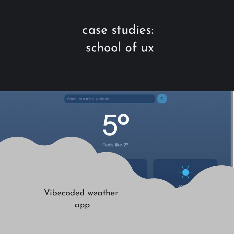
Vibecoding a weather app using the Lean UX framework and APIs
Development with AI
AI-assisted app builders enable rapid development, but without a UX structure, they can lead to inefficient iteration, unclear requirements, and wasted resources.
The challenge was to design and build a functional, accessible weather app using Lovable while maintaining UX rigour, minimising credit usage, and ensuring the product was measurable, usable, and scalable.
Co-designing with Lovable
I treated Lovable as a co-designer rather than a code generator, applying a standard UX framework: planning, validation, iteration, and analysis, throughout the build.
[Sample Generator Block]
Using the planning mode
- Started in Planning Mode to reduce credit usage and prevent premature execution.
- Used Lovable’s scoping questions (audience, location, purpose, visual direction) as a lightweight discovery phase.
- Reviewed and refined the autogenerated plan before approving it, treating it as a design specification rather than a final solution.
- Evaluated data-layer options and selected the appropriate database approach.
- Validated external API requirements by confirming the Met Office API did not require a client ID, unblocking integration early.
Prototyping with Lovable
- Updated the background imagery post-render to better align with the product tone.
- Added a hero icon to the title screen to strengthen visual hierarchy and branding.
- Introduced a persistent header and footer to improve navigation and structure.
Establishing the core functionality
- Added a 7-day weather forecast to increase the depth of information.
- Implemented a location search feature to support multiple cities and user control.
- Inspected the backend structure to better understand how Lovable assembled the app, enabling more intentional edits.
- Applied ARIA roles and descriptive labels to ensure screen-reader compatibility.
- Added structured data markup to improve search engine understanding.
- Validated schema using Google’s Rich Results Test.
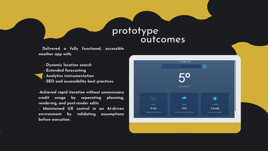
- Delivered a fully functional, accessible weather app with:
- Dynamic location search
- Extended forecasting
- Analytics instrumentation
- SEO and accessibility best practices
- Achieved rapid iteration without unnecessary credit usage by separating planning, rendering, and post-render edits.
- Maintained UX control in an AI-driven environment by validating assumptions before execution.
- Added a
llms.txtfile to guide LLM indexing and interaction. - Explicitly excluded sensitive infrastructure details to reduce risk exposure
[Figma/Quickplayer]
Latest posts

Ethnographic research: Finding Answers
Ethnographic research is one of the key qualitative methods I’ve used to pursue an understanding of users. My primary users for several years were people I needed to persuade to engage with informative content. Content that provided direction, support or understanding regardless of their initial understanding. Finding Knowledge Gaps Project: Podcasts for Curious Minds Research…

Data-driven insights: Reports & Analysis
During my politics degree, I realised I had a real passion for the ‘Why’ in decision-making. This led me to political psychology, which continued to enthral, from my first encyclopaedia of political psychology to a slightly worrying obsession with non-fiction in gender politics, populism, politicians, economics, ideology, policymaking and health disparities. Starting my journey in…

Pedagogy and UX: Customer Education
Translating large amounts of content into digestible lessons is a skill. Tutoring exercised my instructional design skills to communicate methods and practices that supported my own academic learning. Customer education is no different, often coming down to providing multiple pathways to understand content in a multimedia format. Pedagogical UX: Supporting young people Look at how…
